Back to Portfolio
NEXA.co
A consultancy that needed a brand as strong as what it sells: clarity, method and direction for the client’s future.
The Challenge
A consultancy that needed a brand as strong as what it sells: clarity, method and direction for the client’s future.
The Solution
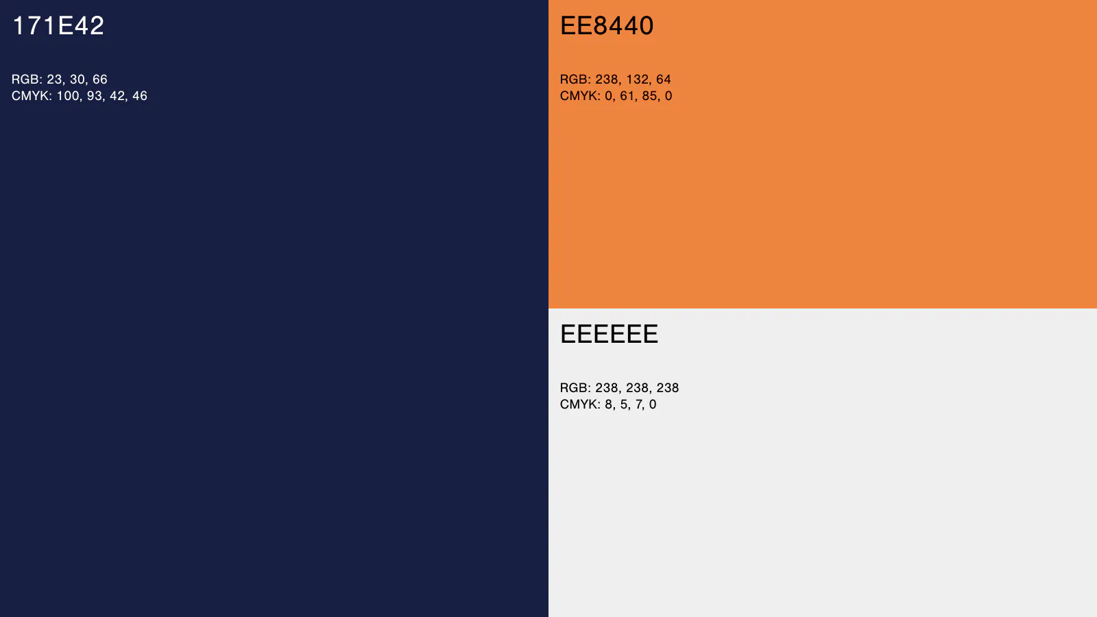
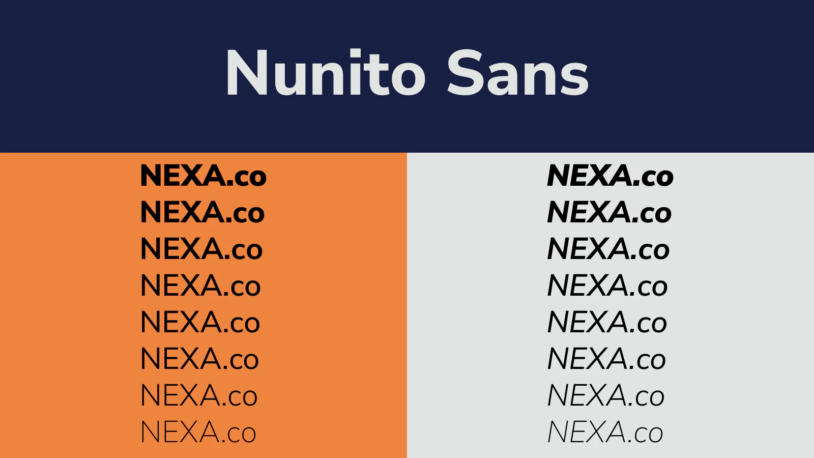
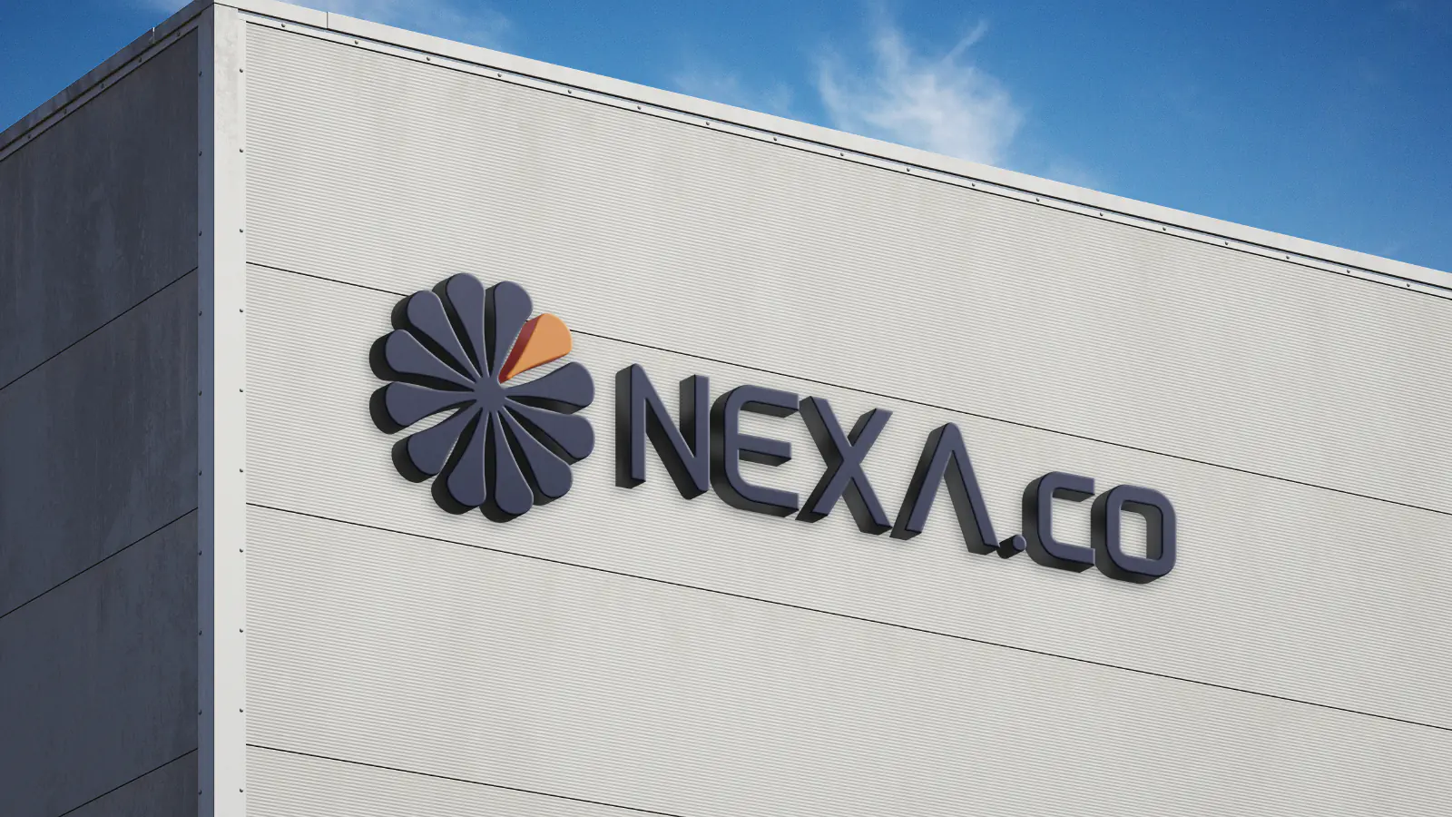
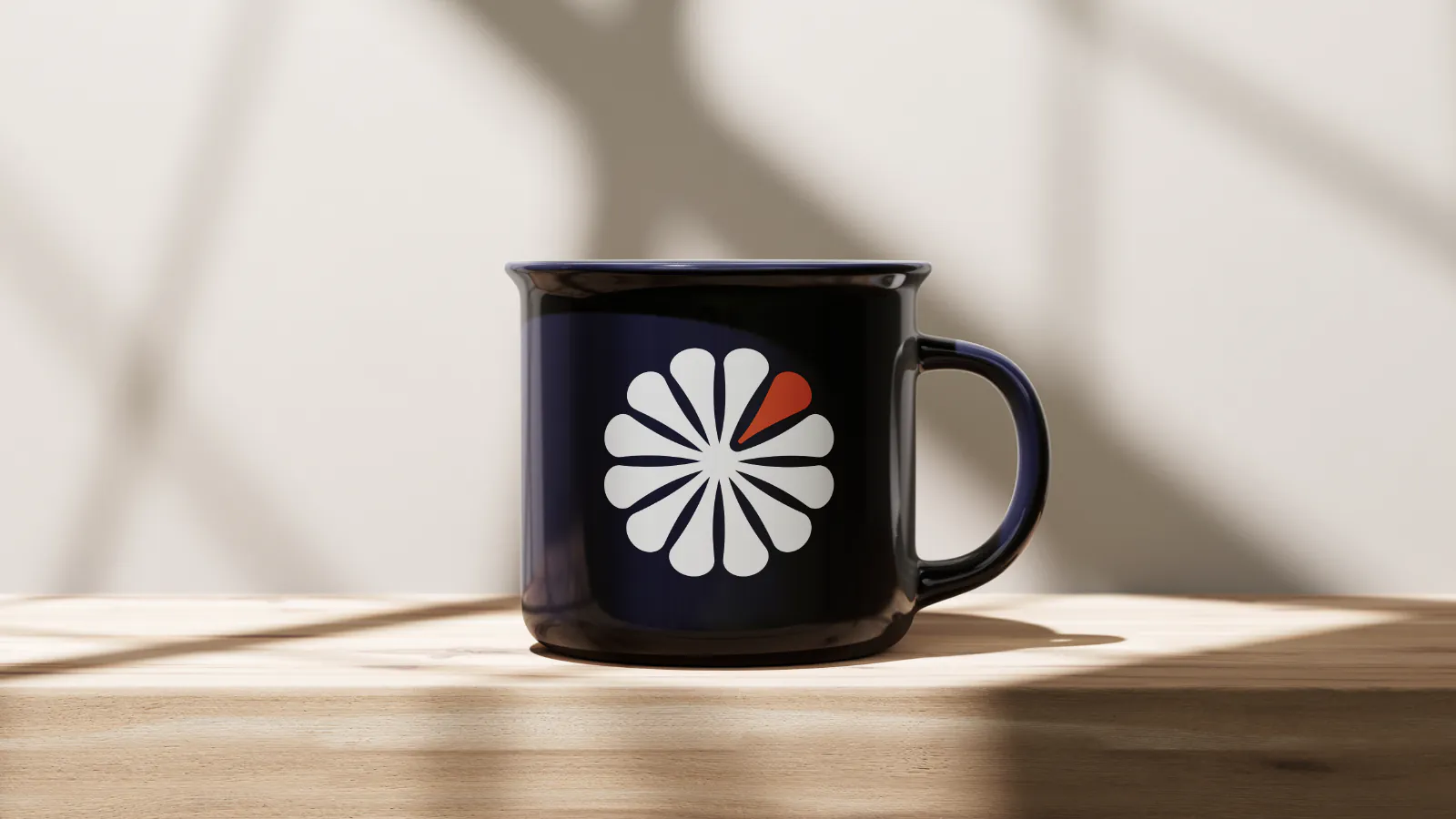
The symbol gathers petals around a shared center, with one of them in orange marking the step forward. Navy and orange bring seriousness and energy in equal measure, and Nunito Sans keeps reading light from the billboard to the mug.
Client
NEXA.co
Executed Services
Visual Identity and Branding
Year
2026